Digital Signage - How to maximize your digital impacts
Time has changed, so has the best practices
Intelligible is the way to go
Intelligible content makes it easy for your viewers to see and understand your message at a glance, and from a significant distance. It’s important to keep in mind that your viewers will mostly be taking in your signage from at least 4-8 feet away. So designing for this perspective will be a valuable asset to the overall success of your message. Here are a few rules of thumb when it comes to styling the text on your digital signage.
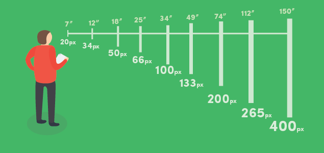
Large font sizes are best decision you’ll ever take regarding signage content when are to be viewed from a distance. This will help people understand your message at a glance. The ideal font size will vary depending on how far your viewer is from the screen. In lobbies and offices, the viewer is usually positioned within 5 -10 ft of display. In case of outdoor applications up to 60 feet away.
Keep it short. Limit the amount of text on your display according to the screen it’ll be displayed on.

Text
To test out the best font size for your design, set up a Display showing various font sizes and try reading it from various distances. Ensure readability of the text with respective background overlay. Your black portion matters. Account for accessibility when designing wayfinding content.
Design for Your Viewing Pattern
Digital signage tends to be received from one of three viewing patterns: Point of Transit, Point of Wait or Point of Sale. Knowing the viewing pattern for your Display, and designing your content to complement it, can greatly impact your success of the signage.
Point of Transit
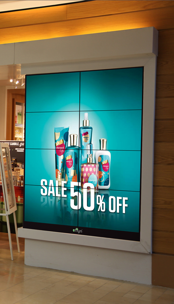
People walking from point A to point B, only a few second to grab viewers attention. Display will be short. In this situation short, concise, messages shown in rotation are the most well received. Keep it BIG, make it short Large fonts against simple backgrounds to avoid distraction from the message.
Point of Wait
Generally in lobbies, elevators, service desks or any other waiting place. People wait for a while in these kind of scenarios, giving the signage flexibility for longer messages and dynamic content.
Point of Sale
Displays used at the point of sale tend to receive the most attention from the buyer, expecting in return heavier content and guided ,informative material. These should help the buyer in making decisions. Design is very important to this viewing pattern. If the sign is being used to increase brand awareness, the brand’s colors and styles should be featured prominently. If the sign is being used to advertise new offerings, strong design will lead to better receptiveness of the intended message.
Less is more
Your signage should never feel like a burden to read. Stick to limited text, and try re-writing your message until it’s as short and concise as it can possibly be.
It matters, how you display it
Always add to your message, never detracting through complicated, unrelated images. When designing graphics or creating video, design in a size that matches the resolution of the device it will be displayed on. You don’t want pixelated or distorted content on large displays. Design in common aspect ratios like 4:3, 16:9, 2:1 as this will allow you to redesign for other screens as well.
Consider the nature of the environment and time your content according to viewers. change according to the dynamic of the space that your Display is in.
Build, Measure, Iterate, repeat
Experimenting and learning from your attempts is the best practice you can maintain when it comes to digital signage. Not sure if something will work? Test it for a day, watch what works and doesn’t, and make the necessary changes for the next day. Following the build, measure, learn strategy will allow you to perfect and tailor your message to your audience and location. Constant iteration will ensure that your message is always being improved and has the biggest impact!


